I was listing this 1935 Excella catalog in the Etsy shop, and I fell in love with this. The one on the left. The one with the collar that could be mistaken for wings. The Dumbo of dresses, if you will. Isn’t it amazing?
The seams. The buttons. The topstitching. Everything combines to make it a memorable garment to enter a room in. This is why I love the 30s so much. It hugs the curves but can stand alone in it’s style. You wouldn’t even need much in the way of accessories for this look to sing. And lest you think that that collar would indeed take flight — NO. The topstitching would help it stay in place just fine.
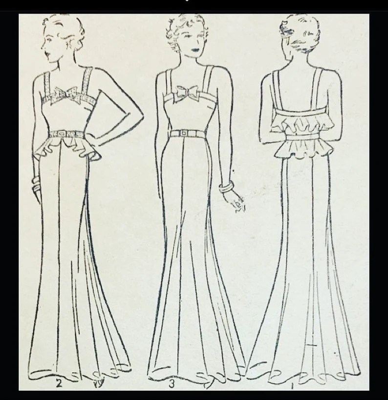
I got this 1931 McCall Quarterly catalog recently. When I was listing it in the Etsy shop today, I came across this article, and it made me smile.
“Sports frocks are somewhat uniform in style. Street dresses have many characteristics in common. But the afternoon costume is another story.
In fact, the formal day mode is varied to the point of appearing irresponsible. But there is really a chic purpose behind each of its moods.
The three models that you see on the right were created for early afternoon hours. and underemonious events. Their formality hints of the casual…in simplicity of lines…fabrics taht are not too elegant…skirts that clear the floor by about ten inches.
For later hours and more formal occasions, designs become a little more feminine, fabrics a ilttle more elegant and skirts quite a bit longer. Sleeves may be either long or short. For a change you may prefer the full-length sleeve in the same from with an ankle length skirt. This combination has a provocative new look about it. “
They go on to talk about choosing accessories: gloves long enough to wrinkle at the wrist, and purses chosen as ornamental, not utilitarian.
It’s funny to look at this with today’s eyes, as we would likely never consider these beautiful garments to be irresponsible or even anything but elegant. But then again, today’s sportswear is anything but elegant, and thinking of an afternoon dress has likely never occurred to the majority of the population. I love this insight into the psychology of fashion in the 30s. It’s one of the reasons I love studying fashion so much, and why, as Miranda Priestley so eloquently put, it’s not just a blue sweater.
Joan Crawford as Letty Lynton, 1932. Dress by Gilbert Adrian.
In 1932, the film Letty Lynton was premiered, and with it, one of the most iconic dresses in screen history. Joan Crawford was costumed by the legendary fashion designer Gilbert Adrian, in a dress full of frills and ruffles, and those sleeves. Ms. Crawford, blessed with naturally broad shoulders, was blessed by Mr. Adrian to be dressed in suits and gowns with even broader shoulders, in order to make her waist look proportionally smaller. And what a look that was!
Adrian turned fashion on its access with his broad-shouldered look, and was a genius at fashion marketing, thinking six months forward in fashion so that his gowns didn’t look dated in the time it took to film the movie and get it to market. Depending upon who you believe, there were millions of this style of dress marketed in the months and years following this one showing up on the silver screen. It was a major movie moment. This, of course, is subject to media hype, as it would seem that we’d see some in vintage fashion now.
So when I came across this 1978 pattern, Letty is the first person I thought of. It’s not a dress, though. It’s a wrap top and tiered skirt, but those sleeves have Gilbert Adrian written all over them. I wonder if that’s what the designer had in mind when it was created?
Of course, it could be that the designer was thinking of flamenco, especially given the girl with the maraca on the left, but either way, it’s a cute look that would look great either together or separate.
After the discussion about unknown designer patterns yesterday, I went to look for as many of the Doublemint Gum designer patterns as I could find. Here is the list. There may be more, but these are all I could find at the moment.
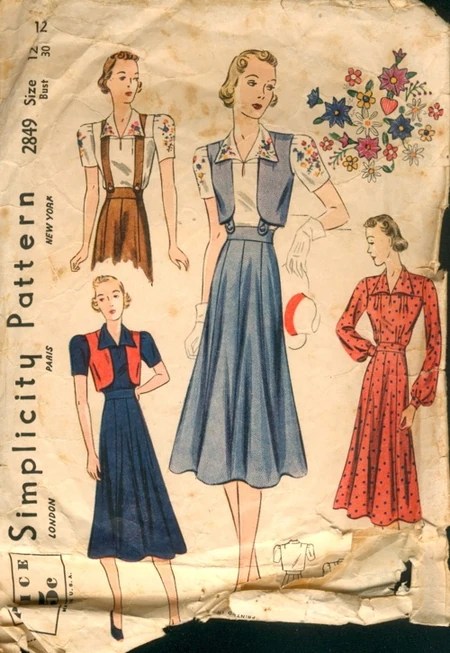
Simplicity 2849, above, is attributed to Sonya Henie as the designer. Now, Sonya was a prolific skater, but did she actually design this, or were they just using her name? We will never know for certain.
This one is different. Though it mentions the movie The Last Frontier/aka The Real Glory, the ad does not mention a designer. If it was designed by the costumer of the movie, it would be Jeanne Beakhurst, but there’s not a way to confirm this attribution.
That is the only one I can find for 1939 that mentions an actress. It may be the only one, and perhaps the movie/designer/actress/pattern/gum collaboration was confined to 1939, but considering they snagged Schiaparelli and Valentina, I’d say it was pretty successful, wouldn’t you?
I’ve posted about Valentina before, but I was listening to an episode of the Dressed podcast today that was about all things Valentina, and it led me to a rabbit hole of sorts. I’m impressionable that way.
They mentioned in passing two things: that Valentina never had commercial paper patterns made of her designs, but also that she was featured in a Doublemint gum ad that featured a paper pattern of the design. A bit of confusion ensued, but I took them at their word and went searching for the pattern. I found out some interesting stuff.
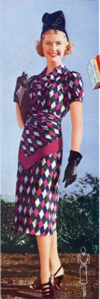
First, the Valentina pattern, as shown in the 1938 ad.
This dress is being modeled by Gloria Swanson, was designed by Valentina, and was produced by Simplicity as #2784. I haven’t found a copy of it, but I don’t think that it is attributed to Valentina on the pattern envelope, if the other information I’ve found is accurate. The ad itself attributes the design to her, and if you really dig deep, you can find that 1938-1939 is full of similar Doublemint ads with other designers as well.
This beautiful dress is modelled by Anita Louise, and was designed by none other than Elsa Schiaparelli herself. It’s beautiful, yes? There are other designers and actresses in this ad campaign, like Joan Fontain, Sonya Henie and a few more. I find it fascinating, because they were taking patterns in the same vein as Hollywood Patterns, by featuring the actress and movie title, but the Simplicity ones actually added the designer names in the ad, if not on the pattern envelope. It’s also advertising in triplicate, which is so smart: the gum, the pattern and the movie the actress is in. Add in the designer – many of whom did not need advertising — and it’s four ads in one! Now that’s smart marketing!
I know that Hollywood has some famous patterns from movies, like the ones based on Gone With the Wind, but I’ve never considered that perhaps those patterns were designed by Adrian or Schiaparelli. I’m not even sure that there is a way to prove if they were, which is what makes this Simplicity series so unique. It’d be a great way for thirties pattern collectors to ad to their collections if they can match designers up with the patterns in their stash. It’s just the kind of sleuthery (is that a word?) that I love, because it’s much harder to match pattern with designer than if you look at a 70s Vogue with the designer’s name emblazoned across the front.
I will not go down this rabbit hole, I will not go down this rabbit hole, I will not……….gotta go!
I found an article from 1935 that mentioned what a woman’s spring wardrobe should be, so I went looking for the patterns. I couldn’t find a lot of them, so if you see any of them, please share and I will update the post. Listed are the patterns, the fabric recommended, and the final price to make it.
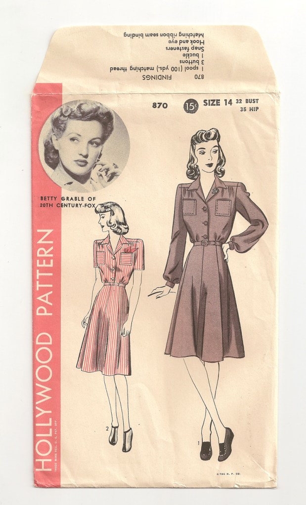
I love the Smithsonian. I think everyone should visit it, although it likely would take a month to make it all the way through the museums. I was wandering around the catalog of the Museum of American History, looking for the dress I mentioned in my last post, and lo and behold what should I find but that the Smithsonian has sewing patterns! Specifically, these two patterns, though there may be more that I haven’t found. Amazing. The first is the iconic Ginger Rogers on Hollywood 1111, circa 1933. The second is Betty Grable on Hollywood 870 from the forties. The Betty Grable one is an odd choice, since there are so many cuter ones with her on it, but I’m not a curator, so what do I know?
Hollywood 870, circa 1940s.
I was more than a little surprised to see at first glance that they do not have any of the Lucille Ball patterns there. She was truly a beautiful woman, and there are some pretty phenomenal patterns featuring her (and Desi). I wonder how they choose what they add. If there are any curators out there, I’d love to know more.
It’s 45 degrees (Fahrenheit) here today, and we’re supposed to get three inches of snow tomorrow, but such is life in Indiana. That being said, spring is definitely coming, and there’s no more beautiful sight to see than beautiful spring fashions.
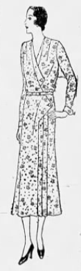
This gown is Pictorial Review 7837. It’s from 1935, I believe, and so pretty. It’s made for those gorgeous spring chiffons, taffetas and organdies, and I see it in a pastel. The cover is damaged a bit, so this is a photo of the back. I feel like it could easily pass for a prom or bridesmaid’s dress today. Even the illustration looks a bit modern – see her haircut? Make it with the peplum and it looks distinctly different than without.
My prom dress was a Gunne Sax knock-off but if I had it to do over, if I couldn’t afford the real Gunne, I’d go for something like this. The fun thing is that it not only is an early printed pattern, but it also includes a sheet that explains how to alter the pattern before cutting the fabric. Very modern, yes?
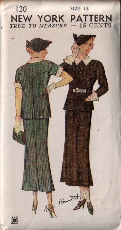
This is a beautiful pattern from the 1933-1936 range. It has the small NRA (National Recover Act) seal on the bottom left front of the envelope. NRA patterns were from the 1930s-1940s. This one has the smallest logo I’ve seen. It’s a fabulous style — look at those cuffs! Interestingly, it also does not say “Gold Seal Pattern” like many New York patterns do, so this is an early one.
The thing I find most interesting is that it has Joan Bennett written on the front. When you compare it, you can see that it’s actually done in her signature:
Photo: History for Sale.
This is interesting to me because I’ve never seen a pattern of this era that was associated with an actress except Hollywood Patterns and Star Patterns. Hollywood, of course, was known for their patterns with stars’ photos in an oval on the front right cover, and they included them in their catalogs too. Star Patterns often had full body photographs of the actress. I’ve only seen a few over the course of time. But I’ve never seen a New York pattern associated with an actress, so this is kind of cool.
Joan Bennett was an immensely popular actress of the era, so I’m not surprised that they chose her. I’m just wondering how many more of these there are out there. Sadly, this one is missing the instructions, so I don’t know if there is anything on the instruction page about Ms. Bennett. If you know anything about them, drop me a line, because I’d love to know.
No sooner had I posted the last post about Cut-Ready to Sew week, then I found the five patterns the store would cut for you. These are all Pictorial Review, from 1931.
Pictorial Review 5506, pajamas ensemble of silk shantung. Sold for $7.62.
Pictorial Review 5514, sport ensemble of white shantung. Sold for $5.09.
Pictorial Review 5701, afternoon frock of printed voile. Sold for $1.01
Pictorial Review 5755, town frock of Picardy crepe. Sold for $3.46.
Pictorial Review 5391, play suit of Zephyr print. Sold for 95 cents.
I think I’d buy both the 5506 and the 5701. I love the seams in that dress, but picture myself lounging in those pajamas. Keep in mind that the prices listed included the pattern AND the fabric, and the cutting was done for free. What a deal!