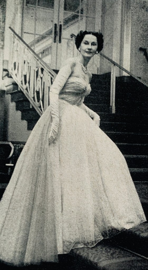
I just added this pattern to the Etsy shop, and I am surprised. It’s from 1980! When you think of the 80s, you probably think of huge shoulders and Dynasty-esque fashions. That is partially right, as those types of styles started showing up around 1984 or so, but the cusp of the 70s and 80s had some very soft, beautiful fashions. The most popular Gunne Sax patterns were from 1979-1981, so there was a lot of gorgeous stuff before it got all serious.
That being said, I would’ve put this one in the late sixties or early seventies. It has a Game of Thrones or Renaissance vibe to it because of that cape, and those weren’t seen commonly in the 80s. If you take the cape away, it’s a distinctly Victorian vibe as was common in that time period. That cape definitely IS the look. Make the dress in a deep color with metallic trim and it could be Mother of Dragons cosplay. Am I wrong? Maybe, but it’s a stunning combination nonetheless.
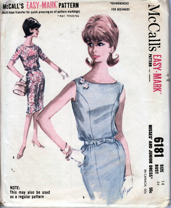
I came across this pattern the other day and learned something new. I noticed the note at the bottom: NOTE: the may also be used as a regular pattern. What the heck? I’d never seen that before. I noticed that at the top it is labelled an “Easy-Mark Pattern.” Turns out that McCall’s put out Easy-Mark patterns starting in 1961, starting with 6004 (a dress), 6098 (blouse) and 6050 (skirt). I guess these three were a test balloon to see how well they did. They premiered the concept at the American Homemaker’s Association Convention in Cleveland, Ohio in July of 1961. The patterns hit stores shortly afterward.
The premise was that a transfer was included so that you could easily transfer the pattern markings to your fabric. As noted, you could use it as normal too. Using the transfer meant you could use your iron to press the markings onto the wrong side of the fabric, thus avoiding the use of tracing paper, carbon, or tailor’s tacks, and avoid damaging the patterns with pins. The transfers were blue, so they were made for use with lighter colored fabric, where the marks wouldn’t be lost. The transfers were able to be used twice, which meant that if you relied on them, you could only reuse the pattern one time. Of course, patterns could be used infinitely if you didn’t need to use the transfer.
These patterns were marketed at the same time as the “Instant” patterns by McCall’s. I suspect that the Instant line may have had more longevity, as I’ve seen tons of them over the years, and this is the first time I’ve seen an “Easy-Mark” pattern. The concept would never fly today because of the cost factor. I’m sure that this likely was the root cause of why we don’t see many of these: sewists don’t like redundancy, and once they have learnt how to sew by transferring markings, they likely didn’t feel the extra step was needed. Ads for the Easy-Mark patterns were few, and totally disappeared by 1965.
What do you think? Would you use these as a regular pattern, or would you like the transfer option?
I read the vintage book Fashion Fundamentals, by Bernice Chambers recently, and wow, is it fascinating. The setting is 1947, which puts it post World War II, but before the New Look dominated the scene, so the world was fresh out of not only a war, but fabric rationing and the huge impact of the war on the fashion industry. It includes everything from bios of designers to descriptions of different fabrics and fur. Cool stuff.
What I found most interesting though, was the stories it told of France’s couture industry during the war, and how they were able not only to keep it going, but keep it in France. The Germans wanted to move the couture industry to Berlin. Lucien Lelong, the president of the Haute Couture Chambre Syndical De La Haute Couture, and though he made a couple of trips to Berlin, he pulled off the absolute miracle of defying the Germans and refusing to move. Can you imagine the absolute bravery of going against the Germans, who wanted to take occupied France’s biggest industry away from them?
Think of the impact this could have had. Christian Dior had not shown a collection yet. The entire Berlin fashion scene — iconic in its own way — might not exist as we know it. Moving couture to Germany would have completely turned fashion history on its head. I am amazed.
Add to this that the German officers and their lives liked to shop in the couture industry, and what the designers did to sabotage it, and you will laugh. They purposely made horribly awful, huge hats for the Germans, refusing to offer them top designs. This shows that everyone can be a defiant cog in the wheel of the opposition if they think it through. I just love the visual on this — imagine godawful hats in the windows where the beautiful tiny sculptural hats of the 40s should be, and German women walking out thinking they look amazing whilst the French laugh at them behind their backs.
The other thing that they did was so united. The couture industry was rationed 2/1000 of the normal amount of cloth they normally were used to. A tiny amount. OK, so they can’t make as many clothes, and marketing would be hard if not impossible, but think of how many jobs this affected. This put an entire industry under threat of unemployment during the occupation. What did the designers do? They had limited fabric to work with, weren’t allowed or able to do fabric embellishments like ruffles or pockets, so they did embroidery and beading. LOTS of it. Doing huge intricate designs kept the embroiders employed and families from going hungry.
The pivots that the French couture industry accomplished during the war amaze me. American industry faced its own restrictions, but we were not occupied, and the restrictions weren’t as suffocating. We could still get good cotton, even if we couldn’t get Asian silks or Italian wools. The French had to completely think outside the box, and did it whilst making life difficult for their oppressors. I love it.
The book will be listed in the Etsy shop in the next day or two.
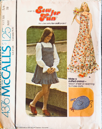
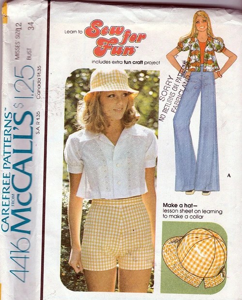
I listed this pattern the other day in the Etsy shop. I’d never seen this series before. It’s called the Sew for Fun series, and the patterns came out in 1974 and early 1975. The styles are the cute boho/cottagecore patterns so popular in the time. This one features a maxi dress with Gunne Sax vibes. It can be made in the shorter mini length as well.
Note: I had a pair of clogs exactly like the ones in the photo.
The patterns featured mainly dresses and tops, are were made in both Miss and Misses’ sizes, with different pattern numbers for each. There are at least two that are unisex: one is a top and the other is for a swimsuit/swim trunks. But the funny thing is those little extra patterns.
This particular one features a stuffed mouse, because every cottagecore girl of the seventies wanted a stuffed mouse, right? I thought at first that it was a pincushion, which obviously any sewist could use. And a young beginning sewist might be pleased to create her own personalized mouse pincushion, right? Only it’s not. It’s a stuffed animal, which seems a little odd paired with the cute dress. But it gets weirder.
Some of these patterns are paired with hats or purses, which makes sense to me. Hats were big in this era, and everyone can use a sun hat. Purses are also a no-brainer. But there are also odd items like garment bags, a wind breaker (for sitting on at the beach, not the jacket), and even a tent. Each of them has a little sewing lesson with it, which is great, but the projects they include are so weird. Like the wind breaker one. If you want to teach someone to make a casing, have them make a pair of elastic waist shorts. But I don’t make those decisions.
I wonder who came up with these little extras, cause they just seem so odd. I get that they were trying to make sewing fun, especially for the Miss crowd, but somehow I am not sure that they thought it all the way thru. It’s one of the more random ideas put out by the sewing pattern companies.
I’m still reading my 1940s book about the fashion industry. It’s been very interesting in reading how mass manufacturing happened, the differences between US and French fashion industries, and how different styles came into fruition. For some reason, this little gem of knowledge was tucked into it. Read the fine print and then say WOW.
Vogue Magazine (US) started in 1892. When it first began, it was a weekly magazine, which I did not realize. These snippets from 1901 advertise weekly patterns that were put out in each issue, so that in the end, you had 52 different outfits, all curated to work together. That’s some fascinating stuff, and boy, do I wish I could see all 52 together. Can you even imagine?
Vogue 100, 1901. Photo: Vogue Magazine.
I wonder if this was the only year that they did this, or if it was a one-off. Sadly, I ordered a 1903 Vogue Magazine — the earliest I’ve ever seen — from Facebook Marketplace, and it never arrived. That might have given me some idea, but alas, it was not to be. I’m still mourning that loss, but it may still arrive, since I only just got a birthday card mailed to me from the next town over in early July. If it arrives, you know I will post pictures here.
Vogue 132, 1901. Photo: Vogue Magazine.
It’s interesting that the pattern numbers are three digit, not four. It’s also amazing to me that they cost $1, which was really pricey at a time that most patterns were five to ten cents. I’d love to see the entire grouping, but Anna Wintour and I aren’t on speaking terms right now (she needs to retire and refuses), so I guess there’s no hope.
It’s these little details about sewing pattern history that intrigue me, as well as the fashion itself. I hope that you enjoy it too.
I like to read vintage magazines with my husband. He loves to cook, so we have lots of interesting discussions about the recipes and presentation ideas women’s magazines have. I was thumbing through an issue of Good Housekeeping from 1946, and wow, was it interesting. It is a thick issue — 334 pages! It includes everything from short stories to recipes to the macabre articles about how to avoid suffocation (!) and what you should do if your house is on fire.
Important side note, from someone who has had a house fire in the middle of the night: the fire department said that sleeping with your bedroom door closed gives you and extra ten minutes if a fire breaks out, because it decreases your exposure to smoke. But I digress.
I was looking, of course, at the sewing patterns they advertised which, surprisingly, were Simplicity, not Good Housekeeping. Since McCalls and Ladies’ Home Journal had their own lines of patterns, I’m surprised that they weren’t doing the same. They did at some point, because I have a few from the sixties, including this Geoffrey Beene delight:
Good Housekeeping pattern 2, 1960s.
But what I found most interesting was that Good Housekeeping put out their own clothing line. I thought at first that the article was just hawking different designer labels, like most do, but when I read it in detail, I realized that they had their own Good Housekeeping Facts First label. In looking around, they applied this label in some of their ads for patterns, and I can’t find any clothing for sale with this label. Interestingly, the article does not tell you where you can buy them locally, or even by mail order. You had to write to the magazine to ask where they were available locally. This seems very cumbersome, especially in today’s click and buy world, and I wonder how long this sales model was sustainable. In looking around, they applied this label in some of their ads for patterns, and I can’t find any clothing for sale with this label, so perhaps it was not for long.
I’m reading a 1940s book about the fashion industry, and am learning all kinds of things about lesser known (now) designers. Case in point: Fira Benenson. I’ve seen Fira Benenson patterns before. They are generally 1950s Spadeas, sometimes very early 1960s, but I’ve never heard of her name outside of this. Turns out she’s an interesting person.
I always thought, given her first name, that she had to be Italian, but she was actually Russian. She was a driving force for Bonwit Teller and got her start as the director of imports there before World War II. During the war years, she was the one who designed Bonwit Teller’s collections. She was one of the first retail buyers to return to Paris after the war.
She was very much a team player, saying that no designer designs in a vacuum. “A designer works with the assistance of many people — the fitters, operators, fabric people and her other workers. I would be helpless without my staff.” This is so true, as you’d be surprised how many designers can’t draw, sew or make patterns. Many of them, of course, would never admit it publicly.
Fira Benenson evening dress with jacket in silk shantung, 1942. Photo: New York Daily News.
Ms. Benenson was noted for elegance. She used rich fabrics and embellished with embroidery, shirring, tucking and intricate seams. In 1941, she used a rounded shoulder technique she terms the “hug shoulder” to accentuate women’s curves. That same season, she showed a “soupcatcher” waist, with horizontal looped draping below the waist that created a shelf -hence the soupcatcher name. It was basically a front pannier and based on a Victorian fashion, and created a beautiful, draped effect that accentuated a tiny waist.
Fira Benenson evening dress, 1957. Photo: Rochester Democrat and Chronicle.
“Miss B”, as her staff called her, was soft spoke and gracious, always wearing black, and generally a shirred dress of her own creation. She always wore a huge black pearl left to her by her mother, surrounded by ribbons of diamonds. She was born in Russia in 1898, the child of the Czar Nicolas’ banker, and came to the United States in 1921, after the death of her mother. She opened her own dress shop and was recruited by Bonwit Teller in 1934 to head up their Salon de Couture. This required frequent trips to Paris to view the collections, as she did not design at this point. She only began designing again in 1940 when the war made it necessary. She opened her own shop again in 1948, going into the wholesale business. She maintained both couture and ready to wear collections, as she felt that women wanted clothes that looked “made to measure” to be widely available.
In private life, Ms. Benenson was the Countess Fira Ilinska, married to a Polish nobleman. She spoke seven languages, collected Belgian blown glass, and was known for her dinner parties, where she did much of the prep and cooking herself. The count and countess celebrated 30 years of marriage in March 1961 with a posh dinner party at their apartment that included many of the same guests who originally attended their wedding, including diplomats, artists, writers and businessman. Four months later, the count died in Paris from heart disease. He was 64. Ms. Beneson died in 1977 in the New York apartment she had called home for many years.
As the fashion industry began to hit its stride after World War II, new fashions began to be seen. Dior’s New Look, of course, was one. Dresses began to be made with voluminous amounts of fabric that weren’t allowed during wartime rationing. In New York, a contest for “Gown of the Year” was held.
14 designers were asked to submit their designs, and they were worn by socialites at the ball. The jury was all men (!), and included Basil Rathbone, Richard Aldrick (a producer), and singer Morton Downey. The winner? Jean Desses, who had not only never been to the US before, but had never exhibited a dress here.
The ball gowns were worth a total of $7650 and were designed by Sophie, Jo Copeland, Christian Dior (New York), Henri Bendel, Ceil Chapman, Mme. Garnett, Desses, Carrie Munn, Lilly Dache (who I didn’t realize designed dresses, as she was known for hats), Oleg Cassini, Charles James, Omar Kiam, Nettie Rosenstein, and Adrian. Shown here (designers as listed above, from left to right).
The winning gown, with Msr. Desses on the right.:
Photo: Life Magazine.
The Christian Dior, New York dress, constructed 80 yards of lace and tulle just in the skirt:
Photo: Life Magazine
The Carrie Munn design. Is that skirt quilted?
Photo: Life Magazine.
The (fantastic) Adrian dress:
Photo: Life Magazine.
No word on the criteria for design or judging, other than it needed to be considered as Gown of the Year. I don’t know if they continued this contest yearly, or if it was just to jumpstart the fashion industry, but I’d love to see something like this today. I doubt we’d see it, as designing for a contest is probably too cost prohibitive for today’s fashion houses, but it sure would be interesting to see. With some female judges this time, please?
I’ve posted about Valentina before, but I was listening to an episode of the Dressed podcast today that was about all things Valentina, and it led me to a rabbit hole of sorts. I’m impressionable that way.
They mentioned in passing two things: that Valentina never had commercial paper patterns made of her designs, but also that she was featured in a Doublemint gum ad that featured a paper pattern of the design. A bit of confusion ensued, but I took them at their word and went searching for the pattern. I found out some interesting stuff.
First, the Valentina pattern, as shown in the 1938 ad.
This dress is being modeled by Gloria Swanson, was designed by Valentina, and was produced by Simplicity as #2784. I haven’t found a copy of it, but I don’t think that it is attributed to Valentina on the pattern envelope, if the other information I’ve found is accurate. The ad itself attributes the design to her, and if you really dig deep, you can find that 1938-1939 is full of similar Doublemint ads with other designers as well.
This beautiful dress is modelled by Anita Louise, and was designed by none other than Elsa Schiaparelli herself. It’s beautiful, yes? There are other designers and actresses in this ad campaign, like Joan Fontain, Sonya Henie and a few more. I find it fascinating, because they were taking patterns in the same vein as Hollywood Patterns, by featuring the actress and movie title, but the Simplicity ones actually added the designer names in the ad, if not on the pattern envelope. It’s also advertising in triplicate, which is so smart: the gum, the pattern and the movie the actress is in. Add in the designer – many of whom did not need advertising — and it’s four ads in one! Now that’s smart marketing!
I know that Hollywood has some famous patterns from movies, like the ones based on Gone With the Wind, but I’ve never considered that perhaps those patterns were designed by Adrian or Schiaparelli. I’m not even sure that there is a way to prove if they were, which is what makes this Simplicity series so unique. It’d be a great way for thirties pattern collectors to ad to their collections if they can match designers up with the patterns in their stash. It’s just the kind of sleuthery (is that a word?) that I love, because it’s much harder to match pattern with designer than if you look at a 70s Vogue with the designer’s name emblazoned across the front.
I will not go down this rabbit hole, I will not go down this rabbit hole, I will not……….gotta go!
I’ve had this pattern for a long time. As in, a long time. I’m not sure why. I think it’s adorable. Romper / playsuit patterns are always popular, and I think this one is wonderful, but what do I know?
I got this pattern as a part of a salesman’s old stock, so it’s brand new and in wonderful condition, so that’s not a problem. It’s a bust 29, which is tiny, of course. My mom was a bust 29 when she got married, but it’s much more uncommon these days. That being said, I sell tiny sized patterns all the time, and people are pretty adept these days at resizing patterns to fit them, so I don’t know that that’s it.
It’s an unprinted pattern, which many sewists aren’t familiar with, so is that it? Perhaps. The rules of unprinted patterns are pretty easy though, so if people get over there fear and decide to expand their skill sets, they will find that it’s not so difficult as they may think.
Personally, I think the problem here is the illustration. Not that it’s not cute, but I think that pattern illustrations or photos definitely sell the pattern, and this one just looks perhaps too old fashioned for some people to visualize. That’s why illustrations look so different. Illustrators are taught to draw in a different scale than we actually are, in order to show the garment off as well as possible. They put the models in elegant poses. I actually prefer illustrated patterns from the 40s and 50s, rather than the modern ones that show the garment on people. Sure, photos show the garment on a real body, but I appreciate the art that went into creating the illustrations, and I look at many of them with a humorous eye, especially when they are seemingly talking with each other, have a tiny person at the bottom, or when they are leaning on imaginary objects. It’s just cute.
But this garment is obviously really cute. The illustration is sweet. The pattern is brand new. So why do I still have it? Please tell me.